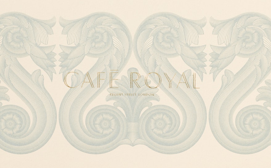
Café Royal, an iconic London venue that has been a meeting and eating place for the avant-garde for over a century, has reopened its doors as a luxury five-star hotel and private members club.
Pentagram has developed the identity and collateral for the reimagined Café Royal, which takes into account its distinct history, as well as its contemporary renovation by architect, David Chipperfield.
Café Royal is one of three hotels in ‘The Set’, a hotel collection that combines landmark buildings with contemporary restorations that are rooted in the heart of the cities they are in. The identity and name of ‘The Set’ were also developed by the Pentagram team and are a key part of the overall strategy for Café Royal.
Café Royal first rose to prominence in the 19th century, after a French wine merchant established it as a Parisian-style brasserie in London. It has been credited with introducing French gourmet food to London and was once considered to have the greatest wine cellar in the world.
It is located on Regent Street, one of two royal streets in London, that was built as a route for the Prince Regent from Carlton House to a proposed but never built summer palace in Regent’s Park. Created for royal eyes, every building on Regent Street is protected with at least Grade II status.
Chipperfield’s renovation combines his modernist rigour with a reinterpretation of historical materials, decorative features and colour palettes. His design brings exterior scale architecture into the hotel’s interior, creating a sense of dramatic opulence.
The identity is guided by two oppositional attitudes. These are grandeur, representing the building’s history and location, and minimalism, representing Chipperfield’s architectural philosophy. This combination creates a tension, which is at the core of the visual identity.
Pentagram also commissioned the graphic artist Kam Tang to redraw exterior architectural elements from Regent Street to create a set of five illustrations. They are a modern take on classical engraving and use the same Regency colour palette as Chipperfield’s renovation.

