
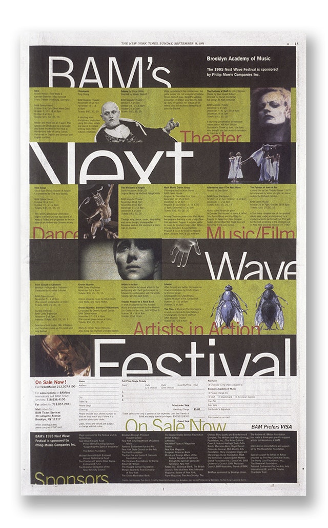


Practically, this design system allows for the use of very large type, even in cramped applications such as newspaper advertisements. More poetically, the use of type stepping from behind horizontal lines suggests the next big thing coming over the horizon.






The Brooklyn Academy of Music–known to New Yorkers as BAM–suffers a fate familiar to many arts organizations. While the institution is often praised by critics, it is constantly seeking to expand its audience. Housed in a grand but aging beaux-arts theater complex dating from the turn of the century, BAM is off the beaten track form many of the performing-arts mavens whose horizons do not extend past lower Manhattan. The exception is BAM’s Next Wave Festival, an annual program of experimental theater and music begun in 1981 that has featured such artists as Tom Waits, Robert Wilson, and Trisha Brown. In step with its experimentation in performance, BAM often used a different designer each year for the elaborate program mailings. This shifting identity exacerbated a problem that focus groups had already identified: Next Wave was a hot brand, able to draw crowds to see unknown acts, but its cachet was not rubbing off on BAM as a whole. To address this problem, BAM brought in Pentagram to design a consistent graphic program for Next Wave in 1995. The unspoken goal was to create a graphic identity that could in time encompass all of BAM, leveraging the image of the whole institution on the strength of its most popular production.
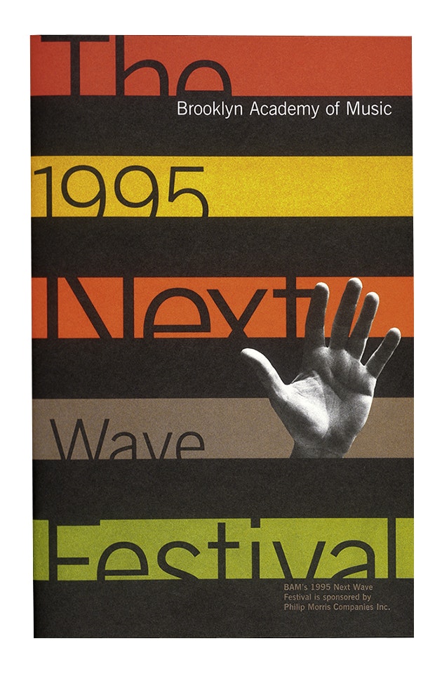
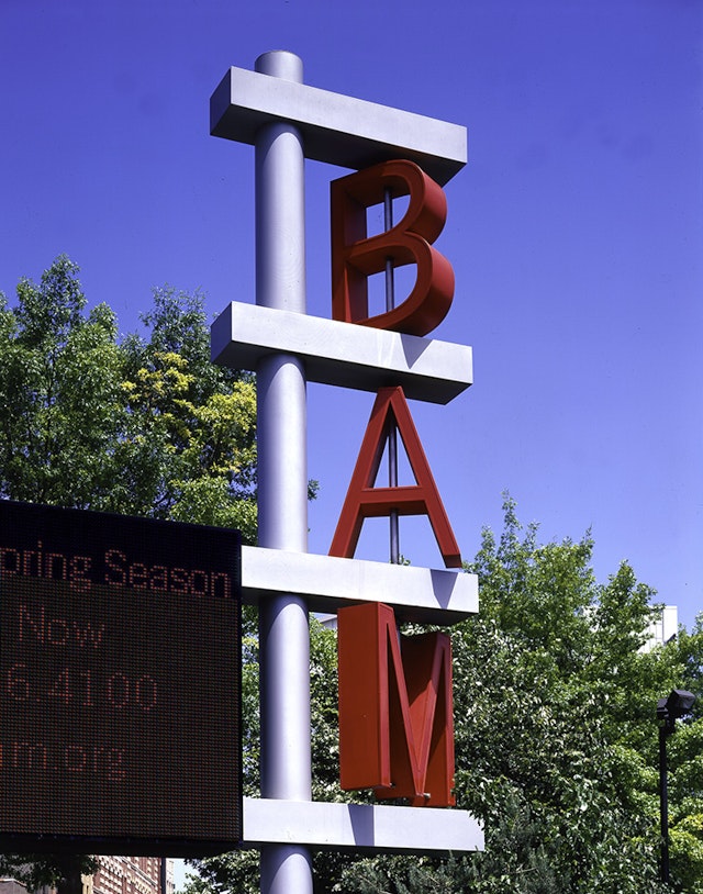
Fragments of News Gothic type obscured behind wide stripes became the basis of the Next Wave look, used on all festival posters, advertisements, invitations, and brochures. Practically, this design system allows for the use of very large type, even in cramped applications such as newspaper advertisements. More poetically, the use of type stepping from behind horizontal lines suggests the next big thing coming over the horizon. After the first of the new Next Wave materials were completed, Pentagram extended the same principles to BAM Opera, BAM’s spring programs, and a wide variety of special events. The design system proved very resilient: BAM’s identity remained identifiable through many manipulations of color and layout. When BAM undertook a major renovation of its historic building in the spring of 1996, it saw the opportunity to extend the new “pan-BAM” graphic image to the building itself. Hugh Hardy, the architect and design consultant on the project suggested using what he referred to as the Cuisinart typography on all new signage in the building. Our signage program for BAM thus became another step toward bathing the institution in the glow of Next Wave.
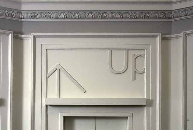
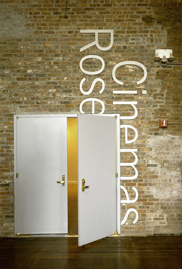
BAM’s two major theaters, the Opera House and the Helen Carey Playhouse, are entered from a grand ground-floor lobby. Signage for these spaces shares the most with the Next Wave graphic approach. Set in existing panels above doorways, the brushed aluminum lettering seems to slide in and out of the rich architectural detail that surrounds it. By bringing the language and sensibility of the Next Wave Festival into BAM’s everyday communications, Pentagram hopes to blur the distinction between the institution and its most popular program, and keep the crowds coming all year round.
Sector
- Entertainment
- Arts & Culture
Discipline
- Brand Identity
Office
- New York
