Broadway Housing Communities is a nationally recognized pioneer in developing permanent, supportive and affordable housing for homeless and at-risk families and adults in New York. Pentagram has designed a new identity for the non-profit organization, as well as the identity and environmental graphics for its most recent initiative, the Sugar Hill Project, located in Harlem’s historic neighborhood of the same name. The branding reflects BHC’s unique hands-on approach to the challenges of poverty and inequality.
Founded in 1983, BHC is known for its innovative model which demonstrates that housing stability paired with high-quality early childhood education and access to the arts transforms lives and strengthens communities. The organization developed and operates seven residential buildings, two early childhood centers, three community art galleries, and, most recently, a children’s museum, in the underserved Upper Manhattan neighborhoods of West Harlem and Washington Heights. BHC’s first ground-up construction initiative, the 191,000sf Sugar Hill Project provides 124 units of affordable housing, an early childhood center serving up to 200 children and their families, and a new cultural institution, the Sugar Hill Children’s Museum of Art & Storytelling.
BHC’s commitment to improving lives extends to design as well: Why shouldn’t someone living in low-income housing have beautiful views and great architecture? The Sugar Hill Project turns its back on the typically somber institutional feel of most low-income housing with a striking form that makes the building an iconic landmark and opens the apartment interiors to views and light. The development is located at West 155th Street and St. Nicholas Avenue in Upper Manhattan, situated at the top of Coogan’s Bluff, a promontory that overlooks the Harlem River and Yankee Stadium. The 13-story building contains residences for low-income and formerly homeless tenants, rising above a base that houses the school and museum.
Adjaye’s architecture is constructed of two cantilevered cube-like forms, with north and south façades marked by a distinctive angled saw-tooth pattern. The building surface is clad in grey corrugated concrete slabs that are embossed with abstracted roses inspired by the floral decorations on historic buildings in the neighborhood.
The designers collaborated closely with BHC leadership to create branding that spotlights the organization’s progressive, innovative and supportive mission. The identity functions as an umbrella for all of BHC’s developments and initiatives, establishing a visual language that is used for sub-brands such as the Sugar Hill museum and school. The BHC logo renders the initials in letterforms that appear to be painted, inspired by the organization’s commitment to education and art, and by the architecture and functions of Sugar Hill, its most high-profile development.
The designers carefully created a logotype that evokes the expressive quality of painting, along with the simple geometry of Adjaye’s forms and the textured surfaces of the building. Straightforward and modern, the typographic logo stands apart from the marks of other homeless organizations, which usually include symbols of houses, doors and hearts. Instead, the painted letters of the BHC logo reflect the organization’s direct, individualized and art-inspired program. The acronym is locked up with a signature set in the friendly, utilitarian font Calibre, which is used throughout the identity.
Anchoring the organization’s identity to the Sugar Hill building’s distinctive profile, the team made a series of sketches that translate the building into hand-drawn icons. The different drawings are used as a logo on various applications, creating a dynamic system that links the branding with the institution’s function as a school and art museum, and suggests the diversity of the development.
At Sugar Hill the building’s three major components—apartments, a school and a museum—correspond to the three core programs—housing, education and art—that are integral to BHC’s innovative model. Thus, the color system developed to represent each of the Sugar Hill Project’s components—black and gray for housing, green for education, and orange for art—is used organization-wide to support BHC’s work at other sites. At Sugar Hill, the colors are utilized in the sub-brands, and integrated throughout the interiors. For instance, the floor of the preschool is green, and the color appears on the signage and communication materials. BHC is the anchor point between all the initiatives, and uses the color black.
The architecture’s thoughtful attention to materials extends to the environmental graphics as well. The “898” identification signage on the building façade is fabricated of brass, which stands out from the textured surface and its neutral grey coloring, and matches the other brass applications on the building. The numbers are angled and extrude from the façade for a dimensional effect that echoes the ridges of the building.
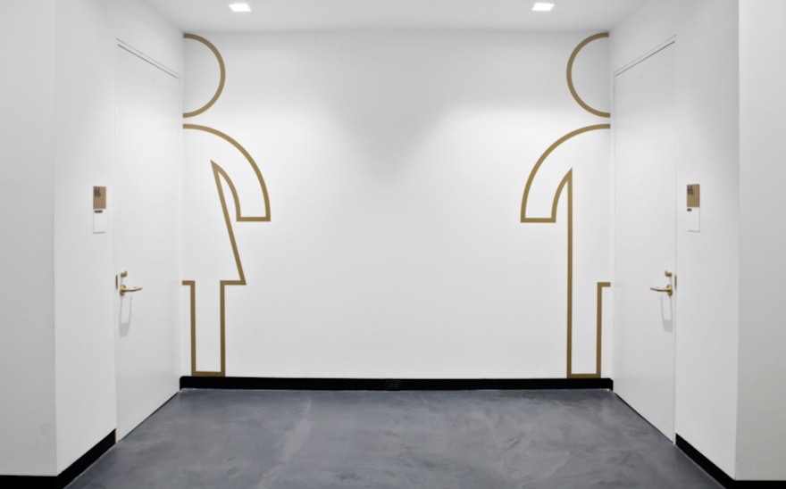
The signage and environmental graphics for the Sugar Hill Children’s Museum of Art & Storytelling and the Museum Preschool are bright and colorful, helping to define the areas within the building. To save wall space for the display of art, directional wayfinding for the museum appears on the floor—where kids are sure to see it. A series of playful custom icons was developed as part of the building’s identity. In stairwells, the oversized child-like icons playfully point the way and interact with banisters and doors. The floors are either concrete or linoleum, and the graphics are directly painted on the surface or output on high-quality vinyl affixed to the floors.
A special brass plaque inlaid in the building’s public plaza features lines from “The Negro Speaks of Rivers” by celebrated African-American poet Langston Hughes, who resided in the Sugar Hill neighborhood during the famed Harlem Renaissance. The marker commemorates the building’s location on the path of the Old Croton Aqueduct that once transported water into the city, and evokes the important history and culture of Harlem, as well as the mission of BHC.

