

As part of the refresh the logo has been completely redrawn to emphasize the basic geometry of the name, creating a typeface that echoes the circles of the original and still looks ‘pop.’


Today’s data-heavy, chart-loving, list-friendly media owe a great debt to Billboard, the trade bible of the music industry that is packed with rankings for the week’s Hot 100 singles, Top 200 albums, and dozens of other categories. Pentagram redesigned Billboard and its graphic identity, including its famous charts, with a new format that helps make the magazine and its in-depth information more accessible and engaging.
The designers worked closely on the redesign under the direction of Billboard creative director Andrew Horton, editorial director Bill Werde, and editor Joe Levy. The music industry has changed enormously over the past decade, and Billboard has kept pace, adding new charts and information and analysis. (For instance, a new “Dance/Electronic” chart launched with the redesign, tracking the burgeoning EDM scene.) The magazine’s target audience is record label executives, artists, music retailers and DJs, but it is also sold to consumers, and is popular with music fans who obsess over the data of their favorite artists.
Founded in 1894, Billboard originally got its name from billboard advertisements for live entertainments like carnivals and fairs. It started publishing musical charts in the 1930s, launched its signature “Hot 100” in 1958, and by the 1960s was exclusively covering music. In the past decade the publication has have transitioned from looking like a trade newspaper—text-filled covers in black and white—to a mainstream music magazine, with color portraits of artists and cover lines.
Since 1966, the magazine’s familiar masthead identity has featured lettering with strong circular forms that suggested records (and later CDs) and kicky “mod” colors. As part of the refresh the logo has been completely redrawn to emphasize the basic geometry of the name, creating a typeface that echoes the circles of the original and still looks “pop.” The designers have set the name entirely in lowercase, tightened the spacing and, perhaps most importantly, removed the colors from the circles. This makes the print version look immediately more grown-up and serious, and a lot easier to design with full-bleed color photographs. The color version of the logo will be retained on the new website (designed by Area 17) as well as in retail uses and event marketing.
Inside, an active and varied design captures the vibrancy of the music business. The magazine’s sections have been reorganized and restructured, with new departments introduced and others renamed. The table-of-contents page is now called “Viewpoint” and features the best quotes from the week’s stories. A new front-of-book section title “Topline” highlights industry news. Headers are paired with graphic bars inspired by the charts. Page layouts are opened up, with graphs, pull quotes and other data appearing in the margins. The design employs a carefully coordinated suite of typefaces, including LL Brown, Lyon Display and Atlas Grotesk for headers, and Lyon Text for body copy. Ziggurat is used for special features and advertorials.
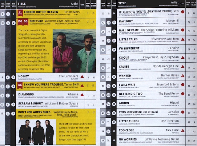
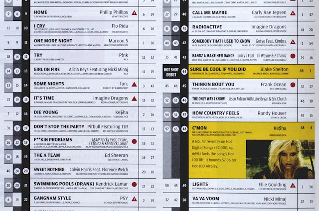
A major part of the project was remaking the magazine’s charts to be more easily understood. The charts now appear at a larger scale and across more pages. The Hot 100 (the top 100 singles) has expanded from one page to a full spread, while the Billboard 200 (the top 200 albums) from two to four pages. In its most recent incarnation, the magazine’s different charts appeared in different colors: hot pink for the Hot 100; gray for Digital Songs; green for Country, and so on. These have been returned to high-impact black and white of the original Billboard charts, with more open spacing that makes them easier to read. In the Hot 100 and Billboard 200, analysis and background on specific hits and artists now appears within the chart.
Positions on the charts are also easier to scan. These were formerly organized so “This Week” appeared first, followed by its ranking in previous weeks. The redesign moves the earlier rankings to the left, in lighter shades of grey, leading up to “This Week” in black, so readers can easily follow the record’s progression on the chart. The “bullets” indicating rising hits are knocked out in white around the chart numbers, and weekly awards like “Greatest Gainer” and “Sales Gainer” are marked by red banner icons. The record’s peak position and weeks on the chart appear to the right of the title. The chart data is set in Amplitude, changed from the longstanding Univers, and chart names appear in LL Brown.
The new back page features “Coda,” a colorful information graphic developed by creative director Andrew Horton that details chart movements and other trends. An iPad app version of the magazine, designed by an in-house team headed by Horton, has also been launched to coincide with the redesign, and the new look will be implemented in a redesign of Billboard’s website, Billboard.com, as well as a subscription business-oriented site, Billboard.biz, designed by Area 17.
Office
- New York
