

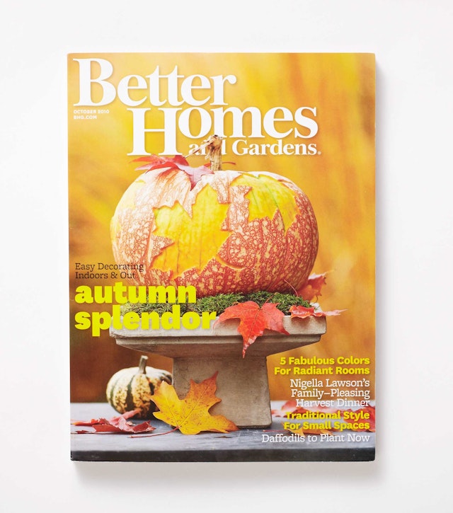
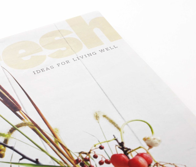
The design supports the magazine's organization by placing an emphasis on the start of each section—opener titles are exaggerated, cropped and rendered in the chunky sans serif font National.


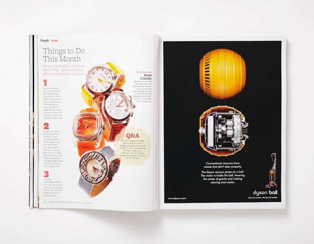

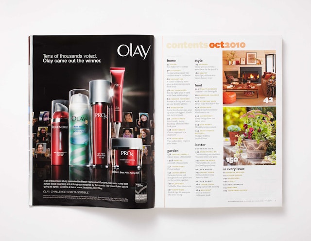

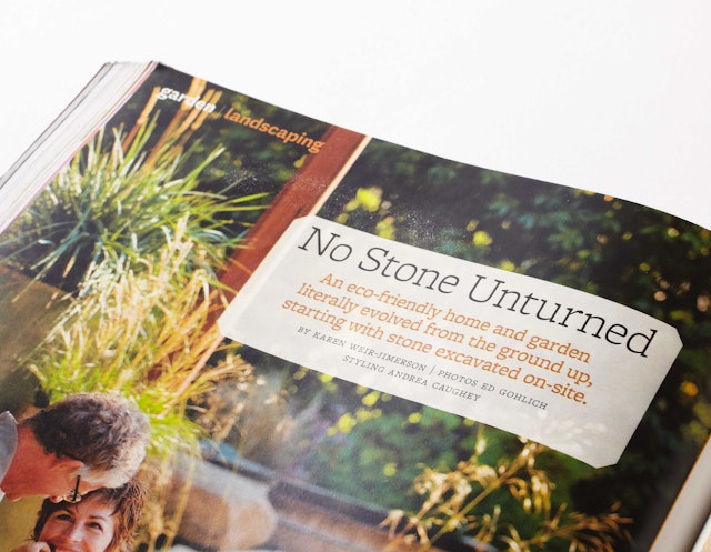


The October 2010 issue of Better Homes and Gardens was the first to employ the newly refreshed editorial design by Pentagram. Pentagram collaborated with Editor in Chief Gayle Goodson Butler, Executive Editor Kitty Morgan and Art Director Michael Belknap, who implemented the launch issue with his team.
The nation's third largest magazine in paid circulation, Better Homes and Gardens has circulation of 7.6 million and a readership of 39 million. Founded in 1922, it is one of the "Seven Sisters" and has guided generations of women in the creation and enrichment of their lives, homes and families. The magazine is the flagship publication of Meredith, the country’s leading media and marketing company serving American women, and the Better Homes and Gardens brand extends to books, products, and television programming. Clean, classic and modern, the refresh is timed to the introduction of new features and designed to serve the magazine’s readers.
The unconventional structure of the magazine provided a unique assignment: instead of a typical front of book, features and back of book sections, the publication presents a collection of departments with short features peppered throughout. The design supports the magazine's organization by placing an emphasis on the start of each section—opener titles are exaggerated, cropped and rendered in the chunky sans serif font National. The bold type is made more delicate by a soft color palette and is complemented by fonts from the Freight family.
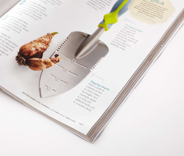
The new design touches the whole magazine from cover to cover and improvements include pure and simple full bleed photography, minimal typography around images, a selective quantity of stories per page, elegant new arrows, and pull quotes energized by shifting lines, just to name a few.
Office
- New York
