Launched in 1965 with a single collection of colorful sweaters, Benetton is today a global success story, producing over 150,000,000 garments a year for 6,000 Benetton stores in 120 countries. Founder Luciano Benetton's commitment to design has been consistent from the start, as demonstrated by timeless architecture by Afra and Tobia Scarpa and Tadao Ando, groundbreaking advertising by Oliviero Toscani, and Tibor Kalman's visionary magazine Colors. In the late 90s, Massimo Vignelli created a consolidated graphic identity system based on Toscani's advertising theme, "United Colors of Benetton."
Ten years later, with Benetton facing an increasingly competitive marketplace, Pentagram was asked to refine that identity system. Did it still make sense to have identical green hangtags bearing "United Colors of Benetton" on every piece of merchandise in every Benetton store, regardless of style or price? How should we express the wide range of product lines the company produces? Finally, what are the company's true visual assets, and how might they be used most effectively?
The result was a new set of guidelines for the application of graphics to items in Benetton’s product lines; on hangtags, labels and packaging; in advertising, promotions, on storefronts and on the web. Pentagram collaborated with an internal team at Benetton led by the tireless Francesca Sartorato to work through every detail of the program.
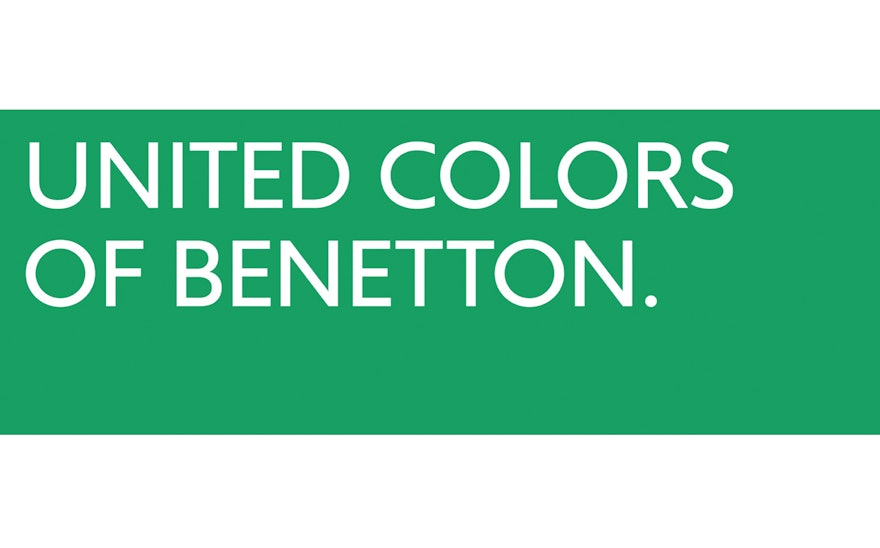
The core of Benetton's identity remains its familiar green tag. We commissioned a new typeface in multiple weights by Joe Finocchiaro to replace the Gill Sans chosen by Toscani in the 80s. This new font provides the basis for an updated United Colors of Benetton wordmark and, beyond that, the whole of Benetton's new brand architecture. Garment labels are vertical to match the orientation of the hangtag.
Pentagram suggested that the company revive its classic "punto maglia" (or "stitch") insignia, an icon that that still enjoyed high recognition although it had fallen into disuse since the early 1990s. We created variations using lines and dots, and combined multiple symbols to create a range of repeat patterns. The geometry of the symbol was also used as the basis of a redrawn Benetton Bunny, the mascot for the company's baby merchandise
The heart of the guidelines document is the articulation of a complete brand architecture for the company. "United Colors of Benetton" now identifies the retailer's core product lines. New lines were created to designate products that were offered at higher price points (Sartoria Benetton, Stile Benetton), or manufactured in different materials and styles (Benetton Cashmere, Benetton Jeans), or targeted to specific customer groups (Benetton Tween, Benetton Baby).
The new brand structure dramatizes the breadth and quality of the Benetton offering, clarifies the way products are organized at point of sale, and makes it easier for consumers to find what they're looking for.
The guidelines provide comprehensive specifications for the way each line is identified, from hangtags and labels to rivets, buttons, zipper pulls and garment tags.
A dynamic fashion company like Benetton depends on innovation and surprise to keep the brand fresh. Pentagram developed a series of logo variations based on the basic geometry of the new Benetton typeface: versions include ones that are stenciled, slab serif, stitched, distressed, handdrawn, exploded, and even a baroque version drawn by Marian Bantjes. Overall, the program at once grounds Benetton more securely in its heritage, and points to new directions for the future. Within a consistent framework, the company has new tools to compete in an ever-expanding global marketplace.

