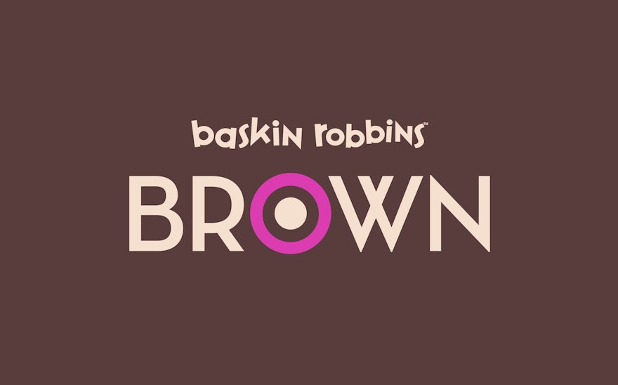
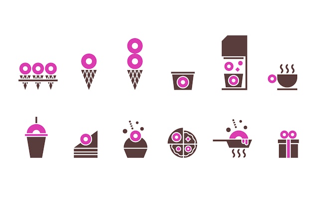
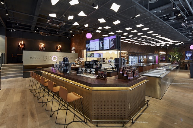
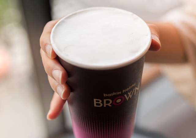
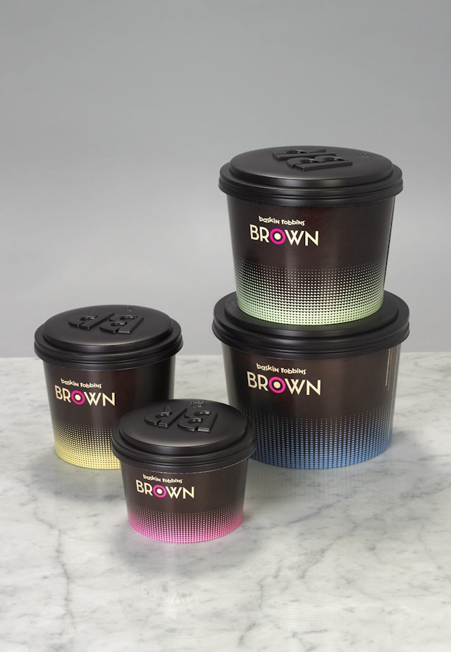
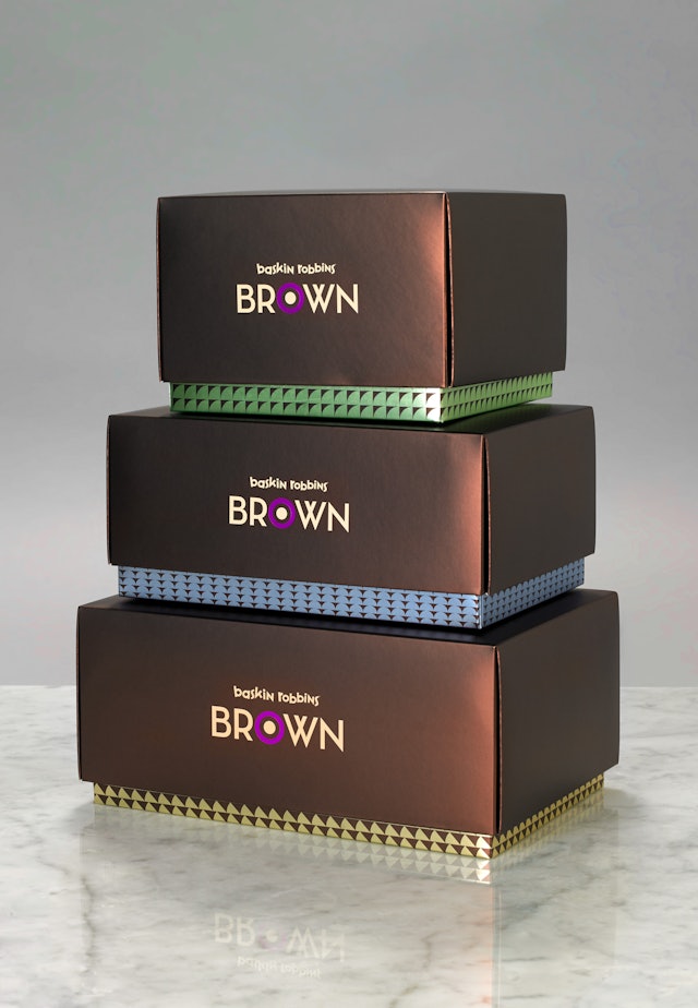
Zoom Enlarge Pentagram has created a new name, visual identity and packaging that moves the concept away from the youthful associations of the original Baskin Robbins brand. Learn more about the project Zoom Enlarge Zoom Enlarge Zoom Enlarge Zoom Enlarge Zoom Enlarge Zoom Enlarge As well as evoking associations with coffee and chocolate, the first two letters of ‘Brown’ act as an acronym for ‘Baskin Robbins’. Learn more about the project Zoom Enlarge Zoom Enlarge Zoom Enlarge Zoom Enlarge A family of circles and spots — extrapolated from the target-style ‘O’ icon — has been applied across the identity, resulting in a coherent visual language that swiftly communicates the cafe's product offering to its time-poor customers. Learn more about the project Zoom Enlarge Zoom Enlarge Zoom Enlarge Zoom Enlarge Zoom Enlarge Share: Twitter, LinkedIn, Email