Pentagram's work for BankUnited presents a new kind of case study: a financial brand wholly reborn after the 2008 economic crisis. Pentagram has created a new identity for BankUnited that positions the consumer and commercial bank for continued success and future growth.
Founded in 1984, BankUnited was the biggest bank in Florida—and one of the largest banks to collapse in the financial crisis of 2007-2010. Focused on residential real estate, the bank succumbed to the risky adjustable-rate mortgages that contributed to the failure of over 300 banks in the crisis. In 2009 the FDIC sold the failed bank to a group of investors, and the new BankUnited was reborn as a startup.
The recapitalized BankUnited has since become one of the most profitable and well-capitalized financial institutions in the U.S. The company has been restructured from the top down and its employees consolidated in a new headquarters in Miami Lakes. The rebirth was capped in January of 2011 with a highly successful IPO, the first brought by a bank resurrected from the financial crisis. BankUnited now has more than 80 branches in 13 Florida counties, with plans to open 7 new locations and eventually expand beyond the current footprint.
The new BankUnited identity is designed to grow with the bank. In its IPO prospectus, the bank stated: “Our customers are attracted to us because we offer the resources and sophistication of a large bank, as well as the responsiveness and relationship-based approach of a community bank.” The new identity communicates the accessibility of a local bank with the gravitas of a global brand.
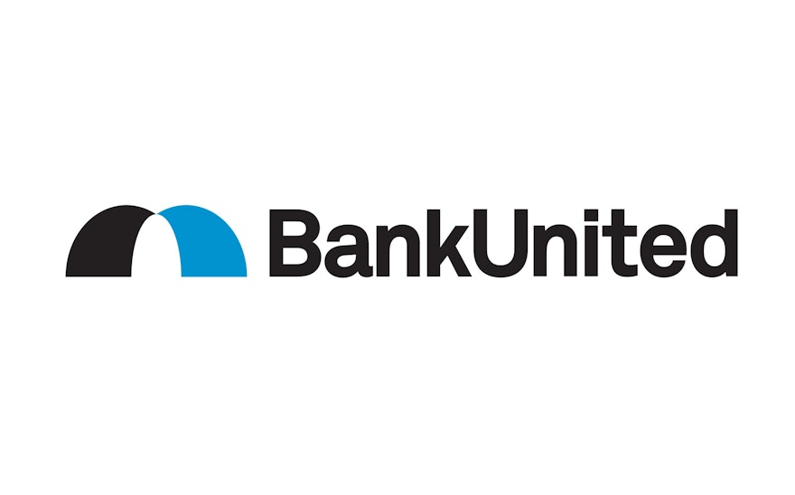
The existing BankUnited logo featured an illustration of a palm tree that attached the company to Florida. The new bank plans on expanding to markets beyond the region, and the designers have created an abstract symbol called “the bridge,” based on the curving forms of the letters B and U. The icon is inspired by the causeways of Miami, but also represents a bridge between south and north, local and global, today and tomorrow, now and the future. The identity captures the aspirations of both BankUnited and its customers.
“Bridges move people and companies from one place to another,” says James Wood, BankUnited’s corporate creative director. “This is the bridge to the future of BankUnited.”
The identity pairs the bridge symbol with the bank’s name set in Akkurat. The bridge will be used as a graphic motif on credit cards, print collateral and digital applications, and the identity is currently being implemented in environmental graphics at bank branches. The new identity made a high profile debut when BankUnited executives rang the opening bell of the New York Stock Exchange on January 28, the day of the company’s IPO.

