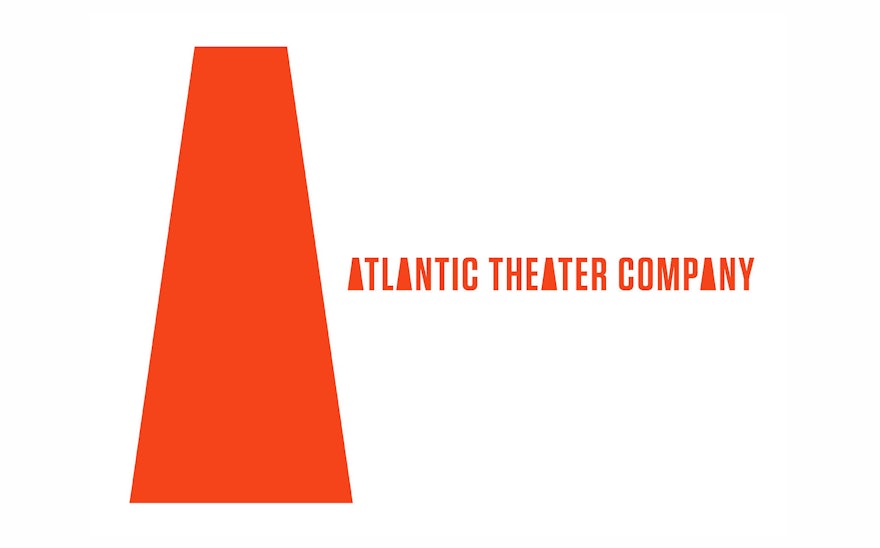
Founded in 1985 by the playwright David Mamet and the actor William H. Macy, Atlantic Theater Company is one of the most influential Off Broadway groups in theater. For three decades, the group has produced groundbreaking works by new and established playwrights, including the Tony Award-winning musical “Spring Awakening” and the 2015 Pulitzer Prize-winning play “Between Riverside and Crazy.” Pentagram has designed a new identity for the Atlantic that reflects its bold, original voice. The program combines a graphic emblem inspired by a capital “A” and strong typography to create an iconic visual personality for the company.
The designers worked closely with the Atlantic’s Artistic Director Neil Pepe and Managing Director Jeffory Lawson to develop the new look. The company wanted a graphic identity that would help it raise its institutional profile and stand out in the city’s crowded arts landscape, with the goal of attracting new audiences, sponsors and partnerships. Highly regarded by the theater community, the Atlantic is most widely known for “Spring Awakening,” but this doesn’t begin to describe the broad range of programming it offers. Based in two buildings in Chelsea, the Atlantic produces six new productions a year, and also runs the prestigious Atlantic Acting School in conjunction with Tisch School of the Arts at New York University. It also presents programs for children through its Atlantic for Kids division, and participates in co-productions with other institutions like St. Ann’s Warehouse. It needed a flexible system that would support all of these initiatives while promoting a cohesive institutional image.
At the heart of the brief were two branding challenges that most performing arts institutions will recognize. First, any arts organization with programming faces the dilemma of promoting its individual productions versus the institution as a whole. Naturally, both need to be successful, but budgets are typically limited and the institutions must find a balance. Often, they want to create an individual image for every production, in the tradition of theatrical promotion like Paul Davis’s iconic posters for Lincoln Center or the widely recognized campaigns for Broadway shows like “Chicago” or “The Book of Mormon.” The problem with this is it promotes the plays but not the parent institution. When the production crosses over and becomes a success—as “Spring Awakening” did for the Atlantic in 2006—it establishes an image for the hit, but with little reward for the organization that first fostered the work.
Secondly, institutions often don’t have any images to use in their campaigns for programming, especially with new productions that have not yet been staged and photographed. So they must invent imagery, and it can be difficult to come up with something suitably iconic and memorable that will carry the spirit of the play. Organizations need a methodology for this as part of their branding initiatives.
The solution is to create a framework where the individual can shine within the institution. For the Atlantic, Pentagram developed a system that can accommodate a wide range of uses but still unmistakably read as “the Atlantic.” The new logo takes the form of an abstract graphic emblem that is inspired by the shape of an “A” and also suggests a megaphone or spotlight. The shape can be used as a device to house—or “stage”—imagery related to a featured play or program, or by itself to represent the company as a whole. The emblem is accompanied by strong typography set in the compact sans serif Tungsten.
Previously, the Atlantic’s promotional campaigns featured commissioned illustrations to represent each production. In the new system, the promotion of the 2015-2016 season plays utilizes found imagery, montages and photo illustrations in combination with the “A” shape to create an iconic image for each production. The approach will serve as a bridge to a more typographic look that layers type directly on the shape, as seen in the subway posters launching this week. The identity’s colors are red, blue and white, in a variety of hues.
The designers helped the Atlantic find a talented in-house graphic designer, Deidre Walski, to implement the new system across all of the theater’s promotional materials and other applications. The system has a built-in flexibility that will allow it to evolve and adapt with the institution over time. For instance, children’s programming features additional colors and more patterns; future seasons may introduce new ways of using the shape.

