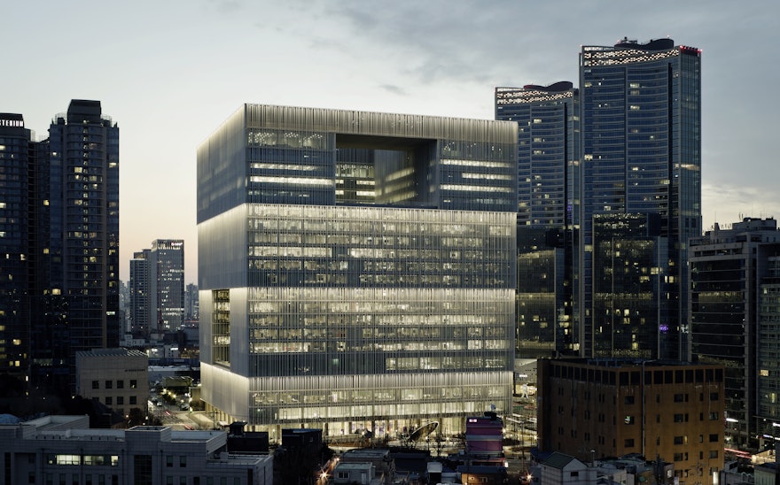
Founded in 1945, Amorepacific is among the world’s largest cosmetic companies, operating over thirty health, beauty, and personal care brands including Etude House, Innisfree and Laneige. Sascha Lobe and his team have designed the architectural branding, environmental graphics and signage for its new corporate headquarters, which is situated in Seoul, South Korea.
The new building was designed by David Chipperfield Architects and takes the form of a cube, punctuated by voids in the façade that reveal an internal courtyard. Alongside offices, a library, restaurant and auditorium, the building also houses the Amorepacific Museum of Art; a collection begun by the company’s founder, Suh Sungwhan.
The design team worked closely with the architects to deliver a fully integrated solution that is harmonious with the building’s architecture and geographic surroundings, and reflective of Amorepacific’s corporate mission.
The building’s form presented a complicated challenge for orientation, as the layout of cuboids are uniform and symmetrical by their very nature. To solve this, the team turned to the new headquarters’ unique geographical surroundings - its central location overlooking the River Han, the Namsan Mountain, Yongsan Park and downtown Seoul. References were derived from these geographical features – with ‘river’, ‘mountain’, ‘park’ and ‘city being used to designate each wing.
Reflecting the building’s geometry, the team devised a matrix that uses Hangul-inspired pictograms to orientate visitors. Taking the form of a grid divided into nine sub-squares, level position is communicated through the middle square, with the framing eight squares providing information relative to position, as defined by the ‘corner number’ and ‘geographic location’ hierarchies.
English, Chinese and Korean are all used throughout the building and presented a unique challenge for the designers. These systems each possess different complexities, and while Korean and Chinese scripts have some formal relation to one another, it is difficult to achieve a satisfactory integration of Latin characters with a line thickness and font size of similar appearance.
Since no typeface existed that would fulfil these criteria completely, Lobe and his team created a Hangul-inspired Latin typeface specifically for the Amorepacific Headquarters. As with the numerals and pictograms, the pared-back, stencilled font is constructed using the Hangul method, resulting in a balanced and consistent visual language throughout the space.
A basic principle of the project was to integrate the signage graphics into the existing structure, as intrusive additions to the architecture would interfere with the visitor’s perception of the concept. Where this is not possible, technically innovative graphical carriers have been used. Mirrored and elegant when inactive, these backlit boards use interactive LEDs and monitors to dynamically communicate information throughout the space.
Alongside providing an architecturally harmonious solution to signage, the mirrored surfaces pay homage to Amorepacific’s connection to the world of makeup and beauty.
