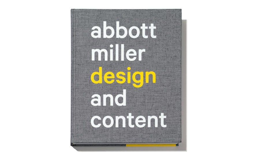
Pentagram’s Abbott Miller surveys his work for the first time in Design and Content, a new monograph out today from Princeton Architectural Press. For the book, Miller assumes both roles of designer and author, presenting his work as a catalog of design strategies that emerge from the unique circumstances of form and content.
The monograph takes readers through projects ranging from books, magazines, and identities to exhibitions, environmental graphics, apps and wallpaper. The book includes a diverse range of projects for clients such as Harley-Davidson, the Guggenheim, Vitra, Knoll, Formica, and Rolling Stone, as well as Miller's pioneering work as an art director and editor, most notably for the visual and performing arts foundation 2wice. The book highlights his collaborations with artists such as Matthew Barney, Yoko Ono, William Kentridge, Twyla Tharp and Merce Cunningham, and architects Thom Mayne (Morphosis), Tod Williams and Billie Tsien, and Diller Scofidio + Renfro.
The book features a foreword by Rick Poynor and an essay by Ellen Lupton. The book also includes a new essay by Miller, as well as three pieces originally written for Eye. A roundtable conversation on contemporary design practice with fellow Pentagram partners Michael Bierut, Eddie Opara and Paula Scher concludes the book.
Design and Content is a 272-page compendium of Miller’s design and design thinking, starting with his training at the Cooper Union in the early 1980s, through the formation of Design Writing Research, the groundbreaking studio he co-founded with Ellen Lupton in 1989, and on to his work at Pentagram, where he has been a partner since 1999.
To assemble the book, the designers tried to put a frame around the diverse range of projects and find the connecting points between them. The title “Design and Content” reflects how the role of a graphic designer is fundamentally as an intermediary between ideas and images and words.
“The book features my work, but its really about how designers are constantly staging content for a reader, a user, or a consumer; the whole endeavor of design is so much about finding the forms and creating a hierarchy that will communicate more effectively or more beautifully, or shaping it in a way that is more memorable or more deeply felt," says Miller.
The projects in the book have been loosely organized according to discipline, with each section introduced by a short phrase. The brief, Twitter-friendly sayings—“a book is a movie you hold in your hands” (for books), “identity links pixels and bricks” (for identity), “the only way to do it is to do it” (a quote attributed to Merce Cunningham, used for the section on the performing arts publication 2wice)—help tie the book together. The phrases also appeared in Miller’s recent exhibition at the Universidad de Monterrey (UDEM) in Mexico.
Designed with a clean, elegant format, the book is richly illustrated with over 350 color images. The cloth-bound cover is embossed, a nod to the sensitivity and tactility of materials frequently found in Miller’s books and environmental work. Grammar, one of Miller’s type-based patterns for KnollTextiles, is reproduced on the endpapers. Titles are set in the contemporary sans serif Calibre, with Akkurat used for text.

