Pentagram has designed branding, collateral and sales center displays for 500W21, a new residential development located where the High Line meets West 21st Street in the West Chelsea neighborhood of Manhattan. The identity was inspired by the building’s unique positioning as an elegant, refined structure within the cutting-edge gallery district.
The team worked with the building’s developer, Sherwood Equities, as well as Corcoran Sunshine Marketing Group, architect Kohn Pedersen Fox, landscape architect Rees Roberts + Partners and interior designer MARKZEFF. Architecturally, the glass and limestone-clad building, which consumes an entire block between West 20th and 21st Streets, is industrial yet classic—in contrast to nearby structures by the likes of Jean Nouvel and Frank Gehry.
For one of the sales office’s gallery-like walls, Pentagram worked with producer Rachel McIntosh of Razor Productions to design and fabricate a 15-foot-tall brass map sculpture depicting the streetscape of the surrounding area. Primarily composed through intersecting brass beams and weathered bolts, the installation also incorporates pieces of green oxidized copper to represent the High Line and other nearby parks. Local hot spots—such as Avenues World School, the Gagosian Gallery and Chelsea Market—are marked by a series of die-cut, numbered metal discs. The sales office also features a model of the building, model kitchens and bathrooms, as well as a custom bird sculpture commissioned by artist Peter Woytuk.
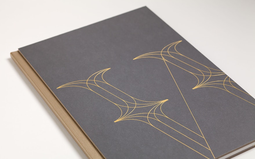
The motif of bronze and metals also played into the print and digital collateral, and copper-hued accents are found throughout the brochure much like they are throughout the building itself. The designers also featured the property’s lush landscaping throughout the campaign. The marketing brochure includes an illustrated "field guide” insert, showing the form and characteristics of the native plants selected by Rees Roberts + Partners. The brochure also utilizes a variety of distinct paper types to relay a more artistic and custom feel, and showcases digital renderings by Tim McAuley and neighborhood photography by Brian Park.
The 500W21 logotype has been set in the stylishly modern serif Austin, with a customized "W" inspired by the building's metalwork. The fonts Mercury Text and Titling Gothic bring a classic and contemporary mix to the branding.
Pentagram previously worked with Corcoran Sunshine on branding for The Printing House.

