Creating a Custom Typeface for the TWA Hotel at JFK
The TWA Hotel opening in the landmark TWA Flight Center at JFK gets its own typeface inspired by Eero Saarinen’s original designs for the building.
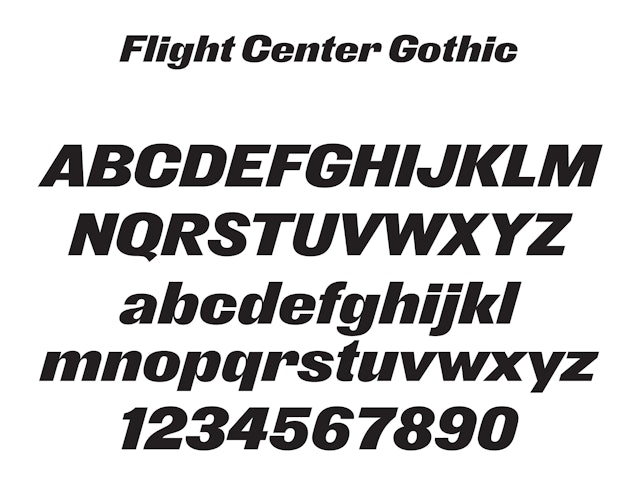
Flight Center Gothic, the new typeface for the TWA Hotel.
Pentagram’s Michael Bierut and team have created a custom typeface for the new TWA Hotel at John F. Kennedy International Airport in New York, set to open on May 15, 2019. The font, newly redrawn by type designer Nick Sherman, will be used throughout the project, which is being developed by MCR/MORSE Development and transforms architect Eero Saarinen’s landmark TWA Flight Center terminal into a 512-room boutique hotel complete with rooftop pool and observation deck, as well as museum exhibitions curated by the New York-Historical Society.
When Bierut was asked by MCR/MORSE to collaborate on a graphic program for the project, he was impressed by their fidelity to Saarinen’s original 1962 design and commitment to bringing the TWA Flight Center back to its mid-century modern beauty.
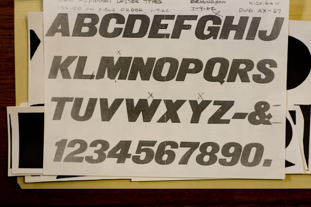
The Pentagram designers wanted the typography to be true to the original lettering found in the terminal. At first glance they thought that Saarinen’s office had used a turn-of-the-last-century sans serif called Derek, but in visits to Saarinen’s papers held at Yale University, they saw all of the signs were drawn by hand, likely from a common set of sources that did not quite correspond to Derek or any other typeface they could find. Moreover, the signs as installed, most of which were still on site, varied considerably from letter to letter, and some letters were completely missing.
Flight Center Gothic.
The team asked Sherman to work with them on an authoritative digital version of the typeface. As part of his research Sherman referred to the drawings by Saarinen, as well as a variety of examples of similar type from the U.S., Holland and Germany, dating back to as early as 1892.
It was only through reconciling all the different sources, always with an eye to evoking the unique character of the original font, that the designers arrived at the new digitized face, which has been named Flight Center Gothic. The typeface, like the building it is associated with, is designed to convey power and speed. It is bold and geometric, yet filled with organic details. Like its inspiration, the typeface is meant to suggest the promise of the Jet Age.
Bierut suspects that Saarinen chose his original typeface because it was closest to the letters “TWA” as they appeared for years on the fleet’s livery. In this way, Flight Center Gothic is to an unusual degree a direct extension of the TWA brand, carrying its spirit from the terminal in 1962 to the new hotel in the 21st century.
Additional coverage: Dezeen.

The complete Flight Center Gothic alphabet designed by Pentagram with Nick Sherman.

Rendering of the new typeface used for signage at the hotel.
Original sketches for TWA Flight Center signage from the Saarinen Archives at Yale University.

Typographic reference material from the Saarinen Archives at Yale University.


